Voucher App Redesign: UI/UX

This is an article of a quick UI/UX task that was designed as an assignment for a company I was applying for. The challenge was to re-design an existing voucher application that allows the users to seamlessly browse and redeem vouchers based on their interests. The whole process took no longer than 6 quite hours. I shall explain the design decision and the reasons taken to finish the app as well.
Here is the link to Behance project:
CHALLENGE
Plum is a rewards redemption platform subscribed to by organisations and used by their employees.
Use Case: BioQuest gives its employees reward points for special occasions (Birthday, Anniversary) and for awards won.
The employees come to Plum to redeem their points for available options. On a regular e-com platform like Amazon, a user arrives looking for a specific product. On Plum, the User arrives looking for something worth redeeming their point for.
What you need to deliver
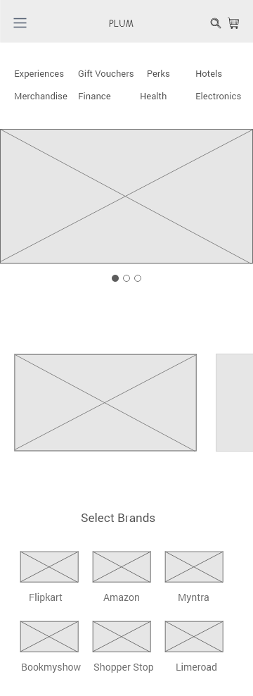
An interactive prototype. You have complete freedom on the design. The wireframes provided are only to specify what data needs to come where. You can choose to add extra data points, if you feel it will make the user’s experience better.


DESIGN DECISIONS
Here, I shall explain all the design decisions and reasons I had taken to finish the app.
This app focuses on quality rather than quantity. Instead of having numerous vouchers which don’t mean a thing to the user, showing personalised vouchers based on the user’s interests and past e-commerce purchases, we can tailor quality vouchers to the user on time. It’s a win-win situation. Users can find what they want quickly, and we in-turn get more users.
This high-fidelity prototype will take a user from the beginning to successfully using his points to redeem a voucher.
UX Decisions
The first and foremost decision I had to take was whether to show all the categories at the homepage and the subsequent pages all at once.
There are many reasons not to include them. Some of them being:
- There is no incentive for the user to scroll down and explore the app. (if all the categories are shown at once, the user will just go ahead with one of it instead of scrolling down and finding the best deals and offers showcased below)
- Most of the times, there are no vouchers available in the respective category. This is a huge let-down as a user who just opened the app and couldn’t even find a deal. Eg: nearbuy.com has almost half of its categories empty.
- Showing too much information at once can be stressful for the user. He/She might be hesitant to continue. Eg: makemytrip
For these reasons & since I had the freedom to design, I have included categories and added them to a separate tab.
I have limited the tabs to 3 in the bottom navigation bar. And this helps increase the user experience in a number of ways.
- Firstly, this is a simple voucher redeeming app. There is no need for bottom navigation bar AND THEN have a side-bar along with the categories listed as a top-bar also. This leads to an unpleasant navigation.
- The 3 categories I have split the app into is HomePage, Explore & Profile.
- Research shows users don’t really use or know if they have a side-bar and how effective or vital it is to the experience. Eg: Spotify, cred…
I have followed and implemented the quote, ‘Less is More’. All the information provided are essential to the user & and the extra and irrelevant details are discarded.
That is why in the
HomePage,
You’ll see a very clean and modern, but all the required information presented in a clean and organised manner. The vouchers you see here at the beginning are the most trending ones at first. And below that there are vouchers personalised for the user.
This helps the user to find what they are looking for easily. And this can be done by asking the user for his interests & email ID so the developer can filter them out from tags and emails.
Explore
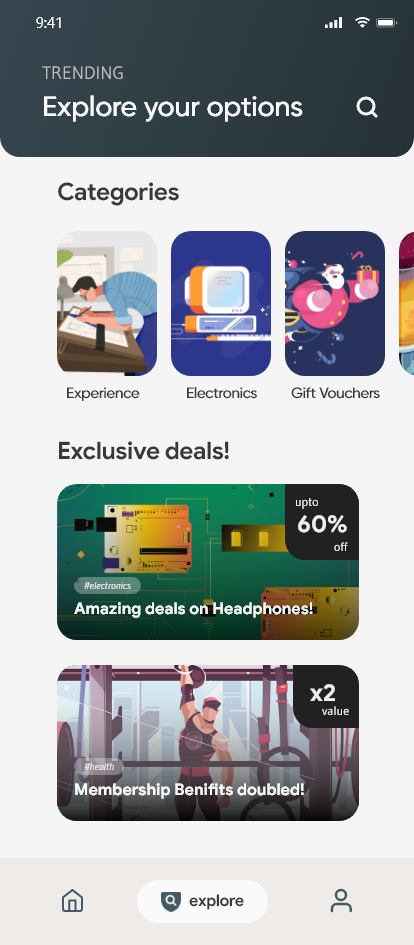
Here, all the categories are displayed in a horizontal scrollable list. Below that is current best deals from each category. Clicking on each will take you to the Details page. And clicking on each category will take you to the respective category page.
Profile
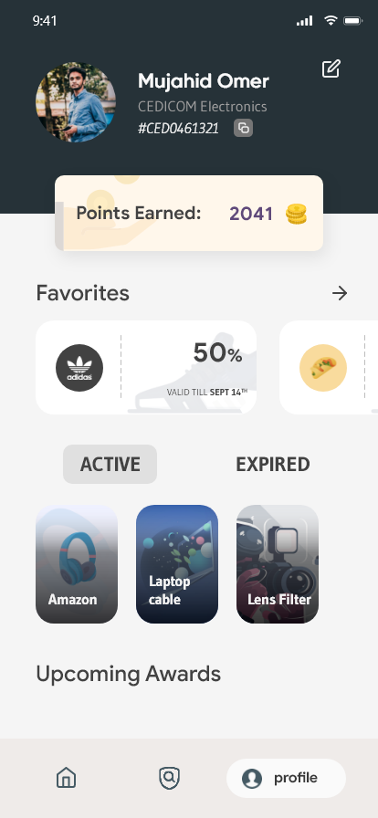
The profile shows the user details like the Name, company and the UserID given out by the company for redeeming points. Then it shows the favorited vouchers & the active/expired ones as well.
UI Decisions
As a cross-platform developer, I know my way around what is implementable and what is a gimmick. All the pages, cards, categories are easily code-able. I have used 3 fonts throughout the app. Gudea, Google Sans & Gilroy. The colours are taken form Google material colour pallet and every colour is easy on the eyes.
Instead of normal full wide-screen banner in the apps out there, I thought it’d be better if the same could be shown in a different way. Plus, here the user can have a sneak-peek to the next card/banner which builds up interest & scrolls through them.
The UI is inspired from the latest UI updates from Google to its service apps like PlayStore, Drive, etc… I have been a long time fan or CRED, HeadSpace, Tide, Reflectly, etc… apps which brings about a positive change in the way a user experiences it.
Here is the link to fully Working High-Fidelity Prototype in Adobe XD:
The screens are displayed below for viewing normally.


That’s it for now. Hope you liked it. I’d love to hear your feedback on this. Please do share and clap if you feel it’s worth it.
